How the design for the official logo for Pope Leo XIV’s visit to France was created
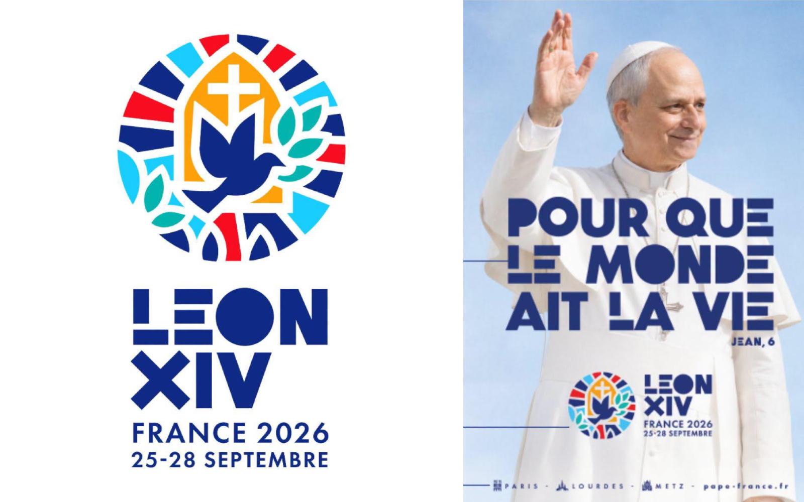
The French Bishops' Conference unveiled the official logo for Pope Leo XIVʼs visit to France, scheduled for Sept. 25–28, and it is a design rich in symbolism.
Instagram post The modern design seeks to express the journey’s theme, “So That the World May Have Life” (cf. John 6), through a visual language inspired by peace, the Eucharist, the heritage of French cathedrals, and Art Deco, one of France’s most iconic artistic movements.
The bishops’ conference highlighted on social media that it is “a striking symbol that combines the dove of peace, the bursting forth of life, and the spirit of our cathedrals' rose windows.” It also noted that “France’s tricolor hues blend with the orange of life and the green of hope, creating a universe that is decidedly joyful and radiant.”
The artwork was created by Atelier Argo , a French studio specializing in design and brand identity. Its founder, Ghislain dʼOrglandes, explained the creative process behind the logo, typography, and graphic elements.
“When the French Bishops' Conference came to present the project to me, they did so using the phrase the pope chose to express the meaning of his journey and visit. I studied…